Building a seamless frontend UX Design is crucial for any website or application. It determines how users interact with your product and is vital to its success. Front-end development technology, encompassing HTML, CSS, and JavaScript, forms the foundation for creating engaging and intuitive user interfaces. This blog post will explore the key elements of a seamless user experience and discuss how front-end technology can help achieve them.

Before diving into the specifics, it’s essential to understand what user experience entails. User experience encompasses the overall impression a user has while interacting with a website or application. It includes factors such as ease of use, visual appeal, responsiveness, and accessibility. By focusing on user experience, you can ensure that your product meets users’ needs and keeps them engaged.
Frontend technology is responsible for the visual and interactive aspects of a website or application. It involves creating the user interface, designing layouts, and implementing functionality. With the right front-end technology, you can enhance the user experience and deliver a seamless and intuitive interface.
To build a seamless user experience, it is essential to pay meticulous attention to several key elements. These elements work in synergy to create a cohesive and enjoyable user experience that captivates and delights users. By exploring these elements in detail, we can gain a deeper understanding of their significance and how they contribute to the overall user experience.
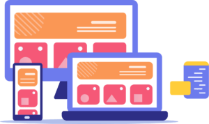
Responsive design ensures that your website or application adapts to different screen sizes and devices. It enables a consistent and optimized experience across desktops, tablets, and mobile devices. By embracing responsive design principles, you can accommodate a broader audience and improve user satisfaction.

Navigation plays a crucial role in guiding users through your website or application. Intuitive navigation helps users find the information they need effortlessly. It involves clear menus, logical information architecture, breadcrumbs, and search functionality. Well-designed navigation simplifies user journeys and contributes to a seamless experience.

In today’s fast-paced world, users expect websites and applications to load quickly. Slow loading speeds can lead to frustration and
User abandonment. Optimizing loading speeds involves techniques such as minification, compression, caching, and utilizing content delivery networks (CDNs). By focusing on speed optimization, you can provide a smooth and efficient user experience.

Consistency in design ensures that your website or application has a unified look and feel. It involves using consistent typography, colors, and spacing across different pages and sections. Consistency creates familiarity and helps users navigate your product seamlessly.
Accessibility is about designing and developing websites and applications that can be used by people of all abilities. It involves adhering to standards and guidelines, such as using semantic HTML, providing alternative text for images, and ensuring keyboard navigation. By making your product accessible, you can reach a broader audience and provide an inclusive user experience.
Choosing the right front-end technology is a critical decision when it comes to building a seamless user experience. Each frontend technology has its strengths and capabilities that can contribute to creating an intuitive, engaging, and visually appealing interface. Let’s look at the key front-end technologies and understand how they are pivotal in enhancing the user experience.
HTML (Hypertext Markup Language) is the standard markup language used for creating the structure and content of webpages. It is the backbone of the web and plays a crucial role in building a seamless user experience.
HTML provides a set of tags that define the structure of a webpage. These tags represent different elements such as headings, paragraphs, images, links, forms, tables, and more. By using these tags effectively, you can organize and present your content in a clear and meaningful manner.
CSS (Cascading Style Sheets) is a powerful front-end technology used to control the visual presentation and layout of webpages. It works hand in hand with HTML to enhance the user experience by defining the appearance and styling of elements on a webpage.
CSS allows you to customize various aspects of your webpage, such as colors, fonts, spacing, layout, and animations. It provides a wide range of selectors and properties that enable you to target specific elements and apply specific styles to them.
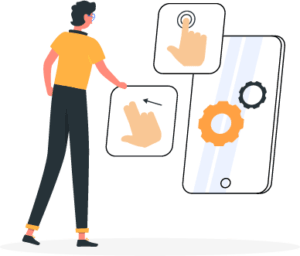
JavaScript plays a crucial role in adding interactivity and dynamic behavior to websites or applications, contributing to a more engaging and responsive user experience. By utilizing JavaScript effectively, you can enhance the functionality and usability of your digital product.
One key aspect of JavaScript is its ability to validate form inputs in real-time. With JavaScript, you can validate user input as they fill out forms, providing instant feedback and preventing errors before submission. This ensures a smoother and more efficient user experience, as users receive immediate guidance and correction.
Implementing responsive design is crucial for ensuring a seamless user experience across different devices and screen sizes. Responsive design allows your website or application to adapt and provide an optimal viewing experience for users, regardless of whether they are accessing it from a desktop computer, tablet, or mobile device.

A mobile-first approach involves designing and developing mobile devices first and then scaling up to larger screens. It ensures that your product is optimized for mobile experiences while providing a solid foundation for desktop experiences.
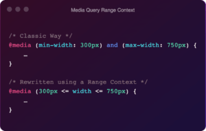
Media queries enable you to apply different styles based on the characteristics of the device or screen size. By utilizing media queries, you can tailor the layout and design to fit different screen sizes and resolutions.
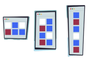
Fluid grids and flexible images allow your content to adapt to different screen sizes. Using relative units such as percentages and viewport-based measurements, you can create layouts that scale smoothly across devices.
Creating intuitive navigation is a vital aspect of building a seamless user experience. Intuitive navigation enables users to effortlessly explore and interact with your website or application, finding the information they need without confusion or frustration.
To ensure intuitive navigation, you need to plan and structure your content in a way that makes it easy for users to find what they’re looking for. This involves grouping related content together, providing clear labels and headings, and ensuring a logical flow throughout your product. By organizing information in a coherent and consistent manner, users can quickly understand the structure and find their desired content.
Menus play a vital role in facilitating navigation. It’s important to keep menus simple, organized, and easy to understand. Utilize clear labels that accurately describe the content or sections they represent. Consider using hierarchical structures, such as drop-down menus or nested submenus, to accommodate a larger number of options while maintaining a clean and uncluttered interface. Additionally, visually distinguishable states (e.g., highlighting the active or selected menu item) can provide visual feedback and enhance usability.
Breadcrumbs are a helpful navigation aid that provides users with a trail of their navigation path. They typically appear as a series of links at the top or bottom of the page, reflecting the hierarchy of pages visited. Breadcrumbs helps users understand their current location within the website or application and allows them to backtrack easily if needed.
Implementing a search functionality further improves the user experience by enabling users to find specific content quickly. A search bar allows users to enter keywords or phrases related to the information they are seeking. This functionality is particularly useful for websites or applications with a vast amount of content, as it saves users from manually browsing through multiple pages to find what they need.
By considering these aspects and implementing clear and intuitive navigation, you can enhance the usability and overall user experience of your website or application. Users will be able to navigate effortlessly, locate information easily, and accomplish their goals without frustration or confusion.
Optimizing loading speeds is a crucial aspect of providing a seamless user experience. Slow-loading websites or applications can result in frustrated users, increased bounce rates, and ultimately, a negative impact on user engagement and conversions. To ensure optimal loading speeds, it is important to implement various techniques that reduce the time it takes for your content to be visible to users.
One effective technique is minification and compression. Minification involves removing unnecessary characters, spaces, and line breaks from your CSS, JavaScript, and HTML files. This reduces the file size and enables faster downloads. Compression, such as GZIP compression, further reduces the file size by compressing assets on the server and decompressing them on the client-side, resulting in quicker loading times.
Minification and compression are techniques used to optimize web page performance by reducing the size of CSS and JavaScript files. When these files are minified, unnecessary characters, such as comments, whitespace, and line breaks, are removed without altering their functionality. This process significantly reduces the file size, making them quicker to download and parse with web browsers.
Additionally, compression techniques like GZIP can be applied to further reduce the size of these files. GZIP compression works by compressing the content before it is sent to the browser and then decompressing it on the client-side. This compression method can significantly reduce the transfer time and bandwidth usage.
Caching is a technique used to store static resources, such as images, CSS files, and JavaScript files, locally on the user’s device or on intermediate servers. By caching these resources, you can avoid unnecessary repeated requests to the server, reducing the load on the server and improving the overall page load time.
When a user visits a website, their browser can store copies of static resources in its cache. On subsequent visits, instead of fetching these resources from the server again, the browser retrieves them from the local cache. This eliminates the need for network requests and reduces latency, resulting in faster page rendering.
Content Delivery Networks (CDNs) are distributed networks of servers located in various geographical locations worldwide. CDNs help deliver web content, including HTML files, images, videos, CSS, and JavaScript files, to users more efficiently by reducing the physical distance between the user and the server.
When you use a CDN, your website’s assets are cached on multiple servers distributed across different regions. When a user requests a resource from your website, the CDN determines the closest server to the user and delivers the content from that server. This proximity reduces the network latency and improves the content delivery speed.
Consistency is a fundamental principle in design that plays a crucial role in creating a seamless and intuitive user experience. When users interact with a product or website, they rely on consistent visual cues and interactions to navigate and understand its functionality.
Creating style guides is an effective way to establish design consistency. A style guide documents the design principles, visual styles, and guidelines for various components used in the interface. It serves as a reference for designers, developers, and other stakeholders, ensuring everyone follows a unified design language. By defining color schemes, typography, spacing, and other design elements, style guides help maintain a cohesive and harmonious visual experience across different sections and pages.
Design patterns are another powerful tool for achieving consistency. They provide reusable solutions to common design problems. By employing established design patterns, designers can maintain consistency in the layout, behavior, and functionality of similar elements or interactions throughout the product. Design patterns not only improve usability but also expedite the design process by leveraging tried-and-tested solutions.
UI components and libraries play a significant role in establishing and maintaining design consistency. These pre-built components encapsulate specific design patterns, styles, and interactions. By utilizing UI components, designers can ensure a consistent visual language and user experience across different screens and sections of the product.
UI libraries, such as Bootstrap, Material-UI, or Tailwind CSS, provide a comprehensive set of pre-designed components and styles. They allow designers and developers to work with a standardized toolkit, reducing the need to recreate design elements from scratch. This not only saves time and effort but also promotes consistency by providing a unified set of UI components that can be reused throughout the project.
Regular testing and iteration are essential to maintaining design consistency. User testing, feedback collection, and design reviews help identify inconsistencies or usability issues that may hinder the overall user experience.
User testing involves observing users as they interact with the product and collecting feedback on their experience. By analyzing user behavior and preferences, designers can uncover inconsistencies, usability bottlenecks, or areas where the design falls short. This feedback is invaluable for making informed design decisions and refining the interface to ensure a consistent and user-friendly experience.
Design reviews involve seeking feedback from colleagues, stakeholders, or design experts. These reviews help identify potential design inconsistencies, spot overlooked details, and ensure adherence to the established design principles. By involving multiple perspectives, designers can address any inconsistencies early in the design process, saving time and effort in the long run.
Inclusive design and accessibility are vital aspects of creating a user experience that caters to diverse audiences. By considering accessibility from the beginning, designers can ensure that their products are usable by individuals with disabilities or different needs.
Implementing accessibility techniques refers to incorporating design principles and features that make digital products, websites, and services more accessible to people with various abilities or disabilities. These techniques aim to ensure that individuals with disabilities can access, navigate, and interact with technology effectively, just like any other user.
Semantic HTML refers to using HTML tags that convey meaning and provide context to the content on a webpage. Instead of using generic tags like <div> or <span>, you should utilize specific tags that describe the purpose of the content they wrap. For example, instead of using a <div> to create a navigation menu, you can use the <nav> tag. This helps assistive technologies, such as screen readers, to better understand the structure of the page and provide a more accessible experience for users with disabilities.
Headings play a crucial role in organizing the content of a webpage. They provide a hierarchical structure that helps users navigate and understand the relationship between different sections. By using <h1> for the main heading, followed by <h2> for subheadings, and so on, you create a logical outline for the page. Properly labeling form fields and interactive elements, such as buttons or links, is also essential. This ensures that screen readers can accurately describe these elements to users and enables keyboard-only users to understand their purpose and functionality.
Images are inaccessible to visually impaired users who rely on screen readers to understand the content of a webpage. By providing alternative text (alt text) for images, you describe the visual information conveyed by the image in a text format. Screen readers can then read this alternative text aloud to users, enabling them to comprehend the context and meaning of the image. It’s important to make alt text concise, descriptive, and relevant to ensure an inclusive browsing experience.
Keyboard navigation is crucial for users who are unable to use a mouse or other pointing devices. It involves designing your website in a way that allows users to navigate and interact with all interactive elements using only the keyboard. This includes providing keyboard shortcuts, ensuring logical tab order, and allowing users to activate elements using the “Enter” or “Space” keys. Focus management refers to maintaining clear visual cues (such as highlighting) to indicate which element currently has keyboard focus. This helps users understand where they are on the page and navigate efficiently.
By following these guidelines, you can significantly improve the accessibility of your website, making it more usable for individuals with disabilities and providing a better overall user experience.
Building a seamless user experience requires careful consideration of various elements and the effective use of front-end development technology. By embracing responsive design, intuitive navigation, fast loading speeds, design consistency, and accessibility, you can create a user experience that delights your audience. Choose the right front-end technologies, implement best practices, and iterate based on user feedback to continually refine and improve your user experience. Remember, a seamless user experience not only delights users but also contributes to the overall success of your website or application.


Founder and CEO

Chief Sales Officer


 About us
 Who We are
 Our Products
 E-books
 Contact us
 Skilled Tasker
 Speedo Delivery
 Best Match
 Locate Bee
 Load Near Me
 Hire dotnet Developer
 Hire Flutter Developer
 Hire Hybrid Developer
 Hire Android Developer
 Hire Frontend Developer
 Hire ReactJS Developer
 Hire NodeJS Developer
 Hire Xamarin Developer
 Hire iOS Developer
 Hire WordPress Developer
 Power BI
 Power Pages
 Copilot Studio
 Power Automation
 Power Apps
 Power Virtual Agents
 Developer Tools
 Databases
 DevOps
 Identity
 Integration
 Management and Governance
 Internet of Things
 Migration
 Mobile
 Security
 Web
Web
 Analytics
 Sales
Sales
 Marketing
 HR
HR
 Supply Chain Management
 Intelligent Order Management
 Flutter Development
 Ionic Development
 Angular JS
 JavaScript
 Wearable
 AR VR
AR VR
 MongoDB
 Amazon Web Services
 MySQL
MySQL
 MSSQL
MSSQL
 Azure Development
 User Experience
 User Interface and Evaluation
 User Experience Review
 Digital Marketing
 Social Media Marketing
 PPC
PPC
 SEO
SEO
 IT consultation services
 Dev Ops
 Launching and Growth Hacking
 Scope of Work
 Product Discovery Workshop
 Strategic Business Analysis
 Food And Beverage
 Banking and Financial
 Travel and Tourism
 Oil and Gas
 Energy and Utility
 E-commerce
 Media and Social
 Healthcare
 Hospitality
 Education
 Real Estate
 quincy
 Customer Support
 Lead Generation
 Appointment Setter
 E-Commerce


